
Search for everyone: what is accessibility and why does it matter?
As a designer, developer, or even product manager, you have thousands of responsibilities. Every project requires a lot of attention — desktop layout, mobile layout, iPhone X layout (thanks, Apple), IE support, Safari support…
So why should you care about accessibility?
Here are some hard facts:
- About 15% of the world’s population lives with some form of disability, of whom 2–4% experience significant difficulties in functioning. (World Health Organization)
- Everybody is sometimes temporarily disabled — in a sense — whether you cut your finger or you try to read on your low contrast screen on a sunny day.
- In certain cases, accessibility might be required by law.
And most important of all:
Everybody is a keyboard user when they are eating with their mouse hand. — Adrian Roselli
By improving the accessibility of your website, you don’t only support disabled people. You will simply make it more usable for everyone.
Don’t reinvent the wheel
We at Site Search 360 have developed a plugin that allows our customers to easily integrate our search solution into an existing website.
As we’ve grown bigger, it was clear to us that we needed to make an accessibility audit. Yes, we should have considered accessibility from the start of the project, but it’s never too late.
You don’t simply “turn on” accessibility.
But don’t worry. Even if you have never thought about accessibility in your current project, it won’t take long to make some improvements. I can’t tell you the exact amount of time we spent making our plugin more accessible, but it wasn’t more than few work days (and about 30 commits).
I will now illustrate the whole process (based on our JavaScript plugin, not a website), so you don’t have to start from the very beginning. But first:
What is accessibility?
Before you get to work, you have to understand what accessibility is actually about. I’m not going to bother you with long definitions. This short sentence summarizes accessibility as I think of it:
Accessibility is the art of making your product usable by everyone.
Who is everyone? What kinds of disabilities should you consider?
- Blindness and colorblindness
- Cognitive disabilities
- Physical disabilities
- Hearing disabilities (yes, your video needs subtitles)
- Age
Some easy steps
Now that you know for whom you are improving your website, we can start looking at the basic concepts of an accessible web.
WRITE SEMANTIC MARKUP
This is probably the most important step. HTML5 has been among us for a few years now, so there is no reason (and no excuse) for not taking advantage of it. Section, article, header, nav, banner and many others — all those tags are there to be used.
You’ve probably seen markup like this (I’ve omitted the classes and ids as they don’t have any semantic purpose):
<div>
  <div>Recipes<span>98</span></div>
  <div>Menu Items<span>1</span></div>
  <div>Grocery Products<span>1</span></div>
</div>
Believe it or not, this was our content group navigation (you could click one content group and the search result page would automatically scroll to the relevant search results). You wouldn’t guess that, would you?
There are few problems with this markup. How can someone who depends on assistive technologies tell this is navigation? They can’t. Is an active element represented by div? Yes, it is.
Look now at the following piece of markup:
<nav role="navigation">
  <ul role="menubar">
    <li>
      <button role="menuitem">Recipes<span>98</span></button>
    </li>
    <li>
      <button role="menuitem">Menu Items<span>1</span></button>
    </li>
    <li>
      <button role="menuitem">Grocery Products<span>1</span></button>
    </li>
  </ul>
</nav>
Much better, isn’t it? Let’s review the most important concepts of semantic markup:
- Use semantic elements
- Always use
<main role="main">to mark main content - Add
roleattribute to support older browsers - Use sections instead of divs where appropriate
Spanis not abutton— don’t repurpose the meaning of elements (unless absolutely necessary)- Use
buttonsfor in-page interactions - Headings are one of the most important parts of every webpage. Always have a single
h1heading and don’t skip heading levels
What to do: Review your current markup, check the content and heading structure, make sure interactive elements are represented by a button or elements, and use HTML5 semantic tags.
MAKE ALL FUNCTIONALITY AVAILABLE WITH A KEYBOARD
This is also an important one. Every single interaction should be possible with a keyboard.
Let’s consider an example similar to the previous one. We did have a “Show more results” button that wasn’t actually a button. Can you guess? Yes, it was a styled div.
Could we support keyboard controls for such an element? Yes, we could, by making it focusable and handling click and keyup events while testing whether the enter or space key was pressed.
Nonetheless, it is still more difficult than simply changing the markup from <div> to <button> — in this case, you just have to bind a click event and don’t have to force the DOM element to be focusable (and as a bonus you don’t have to write that many styles).
Major takeaways:
- All functionality should be accessible by keyboard
- Do not remove outlines from focused elements (if you don’t like those outlines, you can always style them)
- In-page interactions should be represented by a
button - Off-page interactions (links) should be represented by an anchor (
<a>) - Buttons are meant to be triggered by a click, enter, and space, anchors by click and enter press
What to do: Make sure all interactive elements are accessible (and controllable) by keyboard, focused elements are highlighted, and the tab order actually makes sense.
SUPPORT SCREEN READERS
Take a look at the following image:
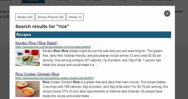
It should be easy to tell what the button in the top right corner does. It closes the layer. The next image simulates what a blind person would be able to “see" when using a screen reader software:

You’ve already seen the full image, so you know what action the same button is meant to perform. Would you be able to tell by looking at the second image? You wouldn’t — the cross is rendered using a background-image CSS property and the button has no inner content at all.
That’s what aria-* attributes are for. By enhancing the button’s markup with a simple aria-label attribute, you don’t have to try hard to make the button’s inner text be hidden in your presentation layer.
<!-- Wrong markup -->
<button></button>
<!-- Accessible markup -->
<button aria-label="Close layer"></button>
<!-- Alternative accessible markup -->
<button style="text-indent:100%;overflow:hidden;padding:0;white-space:nowrap;">Close layer</button>
Did you notice that I also removed the images from the screen reader view? You can label them too using the same technique (where aria-labeledby might be more appropriate). I removed those images because in our case they do not have any semantic purpose and are tagged with role="presentation". Even if they did have a semantic purpose, we don’t usually know that. Most of these images will be illustrational, and labeling them would be redundant — the heading already carries the same meaning.
Attributes you should know:
role— useful for marking the purpose of an elementaria-hidden— tells assistive technologies to ignore an elementaria-label, aria-labeledby— label the elementaria-describedby— use this to describe non-standard user interface controlsaria-owns— marks a relation between two elements
What to do: This step might be the hardest to implement correctly and test properly. Make sure all images have an alt attribute, all sections and interactive elements are labeled, and test with screen reader software.
How to test: Using a screen reader as a sighted person might not feel natural, so first take some time and familiarize yourself with the software of your choice (and you might want to test all of the most common ones — VoiceOver on Mac, NVDA, and Jaws on Windows and TalkBack on Android). After this try navigating your website only using the screen reader software (turn off your monitor). Even a short test will help you get an idea how well your website performs and will reveal the most significant problems.
Bonus: Here is a short (and a bit simplified) example of how we’ve enhanced our autosuggestions. The highlighted parts (and the two <spans>) were added as part of our accessibility improvements.
<!-- Search Field -->
<input type="text" placeholder="search something"
  autocomplete="off"
  role="combobox"
  aria-describedby="unibox-controls-description"
  aria-owns="unibox-suggest-box"
  aria-expanded="true"
  aria-activedescendant="unibox-active">
<!-- Search Suggestions -->
<div id="unibox-suggest-box"
     role="listbox">
  <section aria-labelledby="unibox-suggest-cluster-heading-recipes">
    <h3 id="unibox-suggest-cluster-heading-recipes">Recipes</h3>
    <div
      aria-selected="false" role="option">
      <img src=[...]
        alt=""
        aria-hidden="true"
        role="presentation">
      </div>
      <a href=[..]>Chicken Curry</a>
    </div>
    <div
      aria-selected="true" role="option" id="unibox-active">
      <img src=[...]
        alt=""
        aria-hidden="true"
        role="presentation">
      </div>
      <a href=[..]>Curried Chicken</a>
    </div>
  </section>
</div>
<!-- Announce search suggestions have been changed -->
<span aria-live="polite" aria-atomic="true" role="status" class="ss360-sr-only">2 Search Suggestions Shown</span>
<!-- Suggest Box User Interface Controls -->
<span id="unibox-controls-description" class="ss360-sr-only">
Use up and down arrows to select available result. Press enter to go to the selected search result.</span>
SIMPLIFY PRESENTATION
Accessibility, UI Design, UX — all of those are sides of the same three-sided coin.
Low contrast between background and foreground will make your text hard to read.
Wild animations make your website hard for hungover people (you don’t care? Think about those with ADHD instead — they may find it difficult to focus). Did you know that there is a prefers-reduced-motion media query (even though it is not widely supported yet)? You can simply turn off all your animation if this media query is set. Here is how we do it:
if(window.matchMedia &&
  window.matchMedia("(prefers-reduced-motion: reduce)").matches){
    animationSpeed = 0;
}
You don’t think a website should be some kind of crazy stroboscopic light show, do you?
Conveying information only by color will make the information unavailable for colorblind people. 
Here is an example of how we’ve changed the default layout of our layover view — shorter blocks of text and higher contrast ratios.


One of our pain points has always been mobile autosuggestions. This might be less of an accessibility issue, but we’ve finally added an option to switch to full-screen autosuggestions. Here is a comparison:

What to do:
- Check that blocks of text are not wider than 80 characters and use
line-heightthat is about 1.5 times larger than thefont-size(which should also be large enough — go for 16 px and larger) - Allow zooming (at least up to 200%)
- Check your contrast ratios
- Make sure your touch targets are large enough (44 x 44 pixels is the rule of thumb)
- Where color conveys information, make sure that there is also an alternative way to get the same information
- Go through your animations and consider whether you really need them. Also provide a mechanism to turn them off.
- Forget about captchas…
EVALUATE, EVOLVE, AND INTEGRATE YOUR WORKFLOW
This one is only here because “5 steps” sounds better than “4 steps.” Regardless, always focus on accessibility in your daily (or at least weekly) workflow.
You won’t have to spend large amounts of your budget to do this the right way. So when planning a new feature, think of all the groups I’ve named in the “What is accessibility?” part of this article.
Testing
There are plenty of tools that will help you evaluate how accessible your website is. I would recommend Tenon.io, FAE, and Lighthouse for Google Chrome (open Dev Tools, go to Audits, and click ‘Perform an audit…’).
However, some things are hard to evaluate with automated tools. Try operating your website using only a keyboard. Then try operating it using screen reader software.
Additional Sources
There is much more to accessibility than this post could cover. So here are few resources that might help you get a deeper understanding of the subject:
TL;DR
Use semantic markup, support screen readers, make all interactive elements accessible by keyboard, simplify your presentation, and read at least all the bullet points in “Some easy steps”.
Ok, that’s it. If you are looking for a site search solution that cares about accessibility (or simply for a Google Site Search alternative) we are here for you.
