Search bar optimization: introducing search UI elements
This article explains the different elements of a web search. After reading this, you'll know which elements to look out for when tuning and optimizing your search for your visitors.
Search input
The search always starts with a query. This query could be typed, spoken, uploaded (as an image for example), or even drawn. I'll focus on three common search input methods here.
SEARCH BAR OPTIMIZATION
The classic, good ol' search bar. Not much introduction needed for this one. There are, however, some variations on the type and power of the search bar. Let's have a look at those variations.
Simple Search Bar
How every search bar is born. Naked, no frills, just the bare bones of an input field that can send a query when the user presses enter. If there is a placeholder, the user at least knows the purpose of the search field.
Styled Search Bar
Just one small step up from the simple search bar, but already much more attractive. Thanks to a magnifying glass - the classic search indicator - the user knows what this field is for without even reading the placeholder text.
![]()
Categorized Search Bar
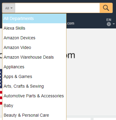
This search bar goes one step further and allows you to pick the category in which you want to search. This is usually necessary when the search catalog is huge and queries could be ambiguous. Amazon's search bar is one of the best examples for categorized search: Amazon has millions of products and queries such as "notebook" can yield very different results depending on the user intention.
Did you mean notebook as in laptop, notebook as in pen-and-paper notebook, or maybe The Notebook which is a book and a movie? To avoid confusion, this kind of search bar already gives the user the option to pre-select the category in which you expect the results.
Instead of a drop down menu, the category search can also be done using tabs, as the Worcester Polytechnic Institute does:

Or using vertical tabs as the library of the University of Houston does:

Instead of letting the user pick the category, the search query can also be parsed as the user types, and the appropriate category is shown to the user. This of course only works if the query can be unambiguously put into a certain category.
Here's an example of that behavior on WebKnox. Once the user searches for nutritional information, the search bar turns green and shows an apple.

This time the user searches information about movies and the search bar indicates the right category here as well.

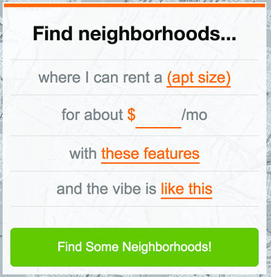
While the search bar only allows for one line of free text as input, the search could be structured more like a questionnaire. Imagine you want to go on vacation. Your travel agent would ask you multiple questions, such as which time of year you prefer, what your budget is, and whether you can cope with heat. After getting this information, he can give you a much better list of vacation options than had you just asked "vacation".
The questionnaire-style search is suitable when filtering should already happen before the search result is shown. Here's an example from NakedApartments where the user just has to fill out the placeholders in the sentence to start a highly targeted search.
VOICE
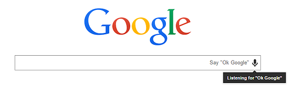
Typing the query is of course just one way of searching. Another is to simply ask using your voice. Speech recognition has made huge strides and has reached near human level of accuracy. Especially on small devices such as smart watches or mobile phones, where typing can be slow and cumbersome, voice search is the way to go.
The good thing is that speech recognition services are plentiful and all they do is transform spoken language into text. From there, search can continue as usual. Here's an example of the "OK, Google" Voice Search.
Suggestions
Suggestions come into play before the user has finished formulating her search query. Search suggestions can help the user decide what they are really looking for.
It should not be underestimated how difficult it is for a human being to formulate what they want and then write it as a search query. People are much better at choosing from existing options than creating their own requests.
No-Query Suggestions
One UI pattern is to show possible or frequently queried search options to the user when she clicks into the search bar. This might even prevent her from searching at all if the suggestions already address what she was thinking about.
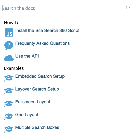
Here's an example of Site Search 360's documentation page that shows possible pathways before even searching.
Typeahead
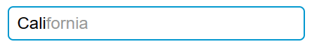
After the user has started typing in the search bar, the search could show most likely continuations of the query. This works especially well when the query can only be in a certain range. Take a search for a US state for example. If the user types "Cal" there is only one way to end this query and the typeahead could show "California". The user now only has to choose to accept the suggestion. This makes typing much faster and is often employed on mobile phones where typing is not much fun to begin with.
Related Searches
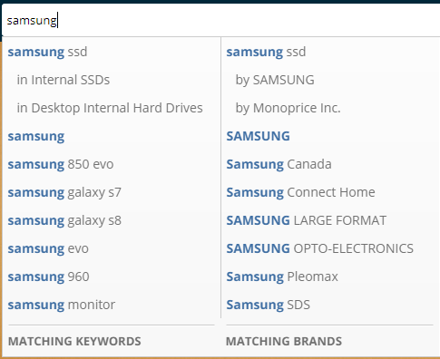
Once the user starts typing a query, related search options might be shown to make it easier for the user to see what other have searched before. This again helps the user pick from a list instead of formulating a new query. Here is an example from newegg of how related searches might look. They have even broken them down into "matching keywords" and "matching brands".
Results
The most important element in a search is the result view. Google has tested millions of variations on its search engine result pages (SERPs) to increase usability. Everything from font sizes and colors to rich snippets and instant answers has been carefully evaluated.
List
A basic result list containing title, link, and a search result snippet is one of the easiest and best understood visualizations by the user.
Grid
For more visually driven results, the grid layout is dominating. While text is better scanned vertically, images can be put in such a grid because they can catch someone's eye without the person focusing on it like he would if it were text. Here's an example from Pinterest.
.png)
Tabs
Just like with the categorized search bar, results may fall under different categories. Tabs are a typical way to let the user choose which category she wants to see results from. Google for instance provides not only website results, but also categories such as images, news, videos, and shopping.
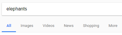
Tabs are already a kind of filter, but generally only used when there are few categories and they apply to a large number of searches. For almost every query you can expect website and image results, for example. Category filters (see Amazon) are more practical than tabs once you have a large number of categories that may change or be query dependent.
Other methods of visualizing the result list include accordion widgets or displaying the results directly beneath the search bar as the user types.
Pagination
Depending on the size of the catalog, there might be thousands or millions of possible search results. Of course, the user cannot view them all so they need to be ranked and chunked. The best results must be within the first few results and it usually does not make sense to give the user the possibility to page through thousands of results.
A study by the ad network Chitika found that 95% of the search traffic on Google goes to results within the top 10. The very first result gets almost a third of the entire traffic! This is at least true for information-seeking queries. For inspiration (think Pinterest), people can scroll/page for hours. So, what are common options for letting the user see more results for her query?
Page Buttons
The simplest way is to show the number of pages along with back and forward buttons.
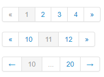
This UI has unfavorable user experience ratings. People usually think it is slow and cumbersome to find and press these buttons.
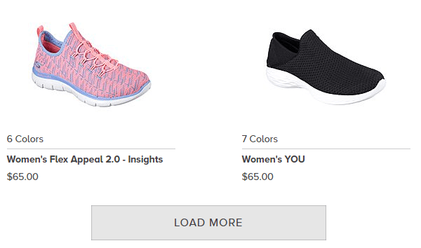
Load More Button
An alternative is to simply show a "Load more" button at the end of the result list. Here's an example from sketchers.com.
Infinity Scroll
Instead of showing any buttons, the results could just be dynamically loaded once the user reaches the end of the result list. Pinterest is a good example of this behavior.
The current recommendation is to use either a load more button or infinity scroll, but the best choice depends on the content in the results. Infinity scroll definitely gets users to see more results, but for online shops a load more button might be better because more attention is given to individual items, which increases conversion rate. I recommend this very detailed and recommendation-rich article for more information on pagination.
Filters
Filters are used to trim down large result sets. The filters are derived from the searchable objects. For example, in a product search, filters will be the features of those products, such as price, color, or size. In web search, the searchable objects are documents, so filters are usually about category, author, publication date, etc. In general there are two types of filters, value selection or ranges.
Value Selection: Multi Select Filter
The most commonly used multi-select filter are checkbox lists where you select the features you want your results to have. All the facets on Amazon are this type. Here's a simple example of a color picker from newegg:
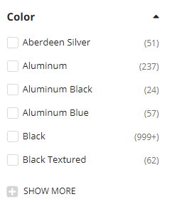
One problem with such filter options is that the user can never tell whether they use AND or OR logic, meaning if I select two colors am I saying I want a product in black AND silver or black OR silver?
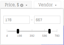
Range Filter
Checkbox lists and other value selection filters are rather unsuitable for properties with a huge number of options, especially numeric properties like price. One solution is to group values into "buckets" and show these buckets as selection filters. For example, a price property would become "Options: 0-$100, $101-200", and so on.
This pattern clearly dominates when it comes to numeric values. The other alternative is to show a slider, which can be more precise but is also potentially more difficult for the user, especially on mobile devices. Here's an example of a slider on leifshop.com.
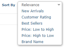
Sorting
The default order of the results is usually the relevance of the results to the given query. However, if the searchable objects can be ranked by another property that they all share, this property can be offered as a sorting parameter. An example of this is the price of a product or the average customer rating.
Here are the possible sorting options on Zappos.
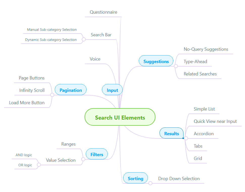
Summary
This article gave you a brief introduction to the most important search UI patterns and elements for a web-based search, to improve search bar optimization. Here's a summary image that covers all the elements discussed in this article.